Offcall
Offcall needed a marketing site that showed the platform was more than a salary calculator. We built a homepage and content plan that mixed product features with real community value. That mix became the base for steady organic growth, now bringing in more than 5,600 monthly clicks without spending anything on ads.
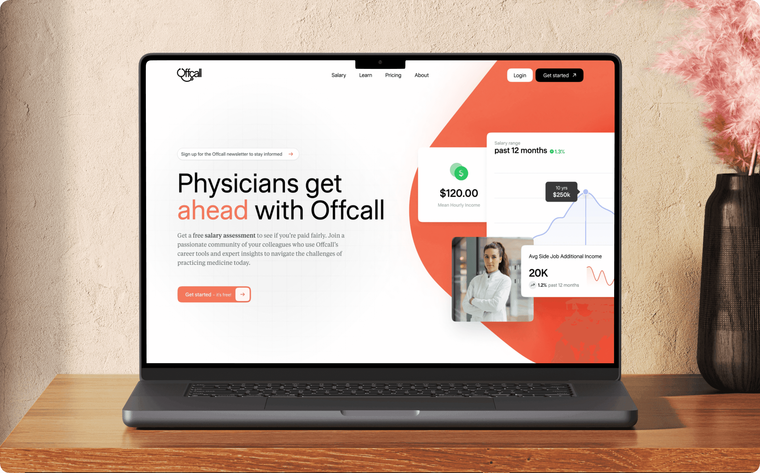
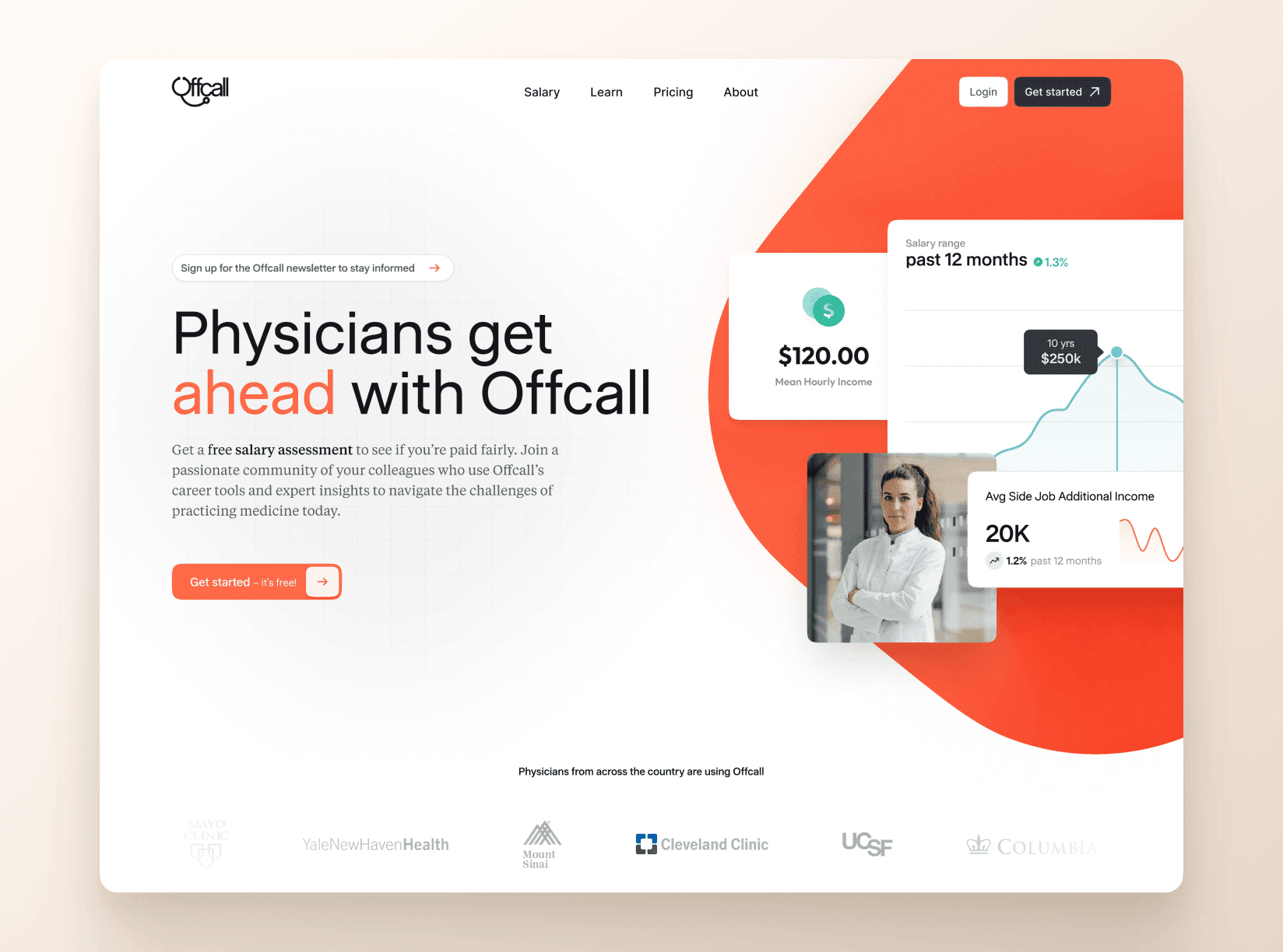
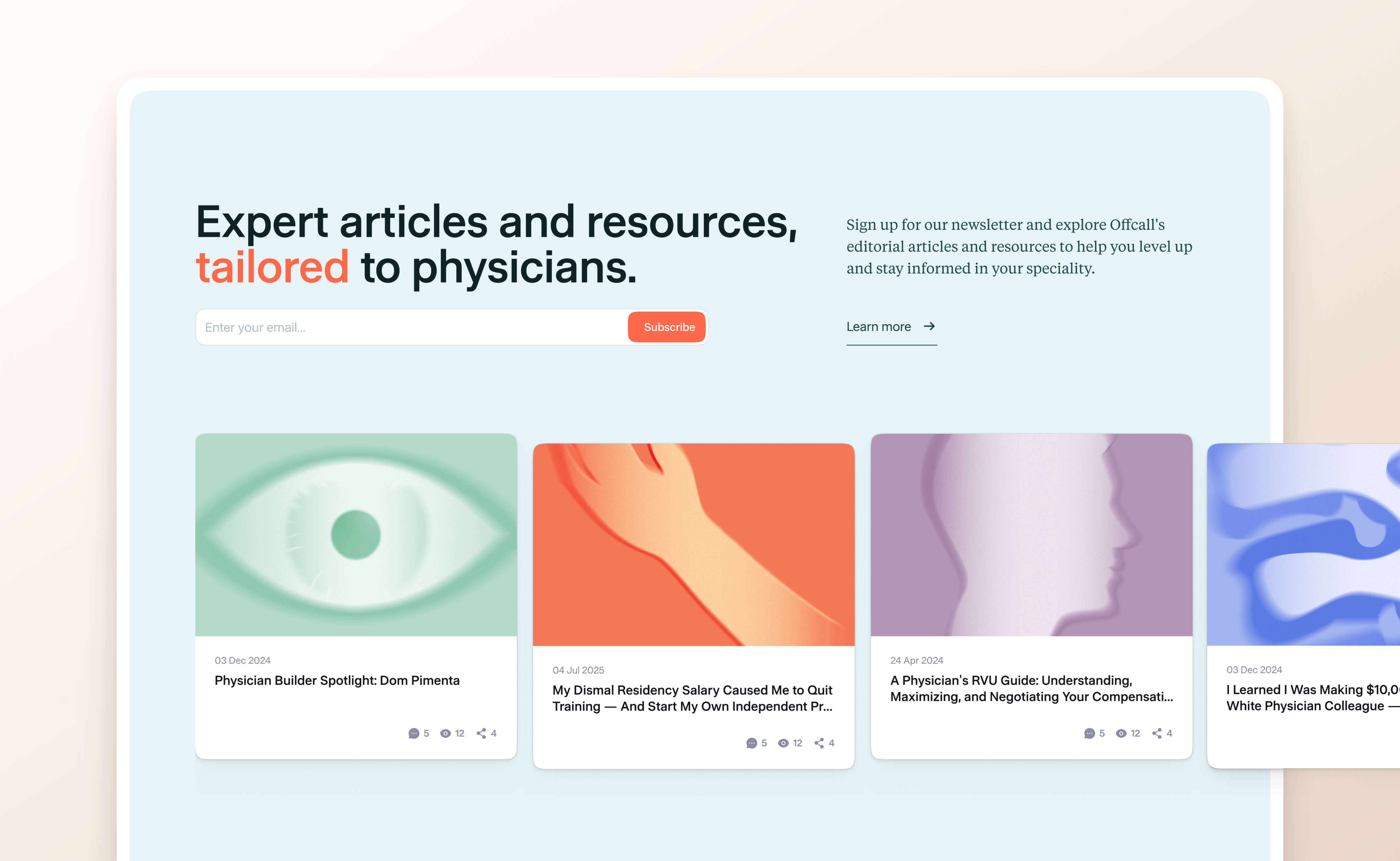
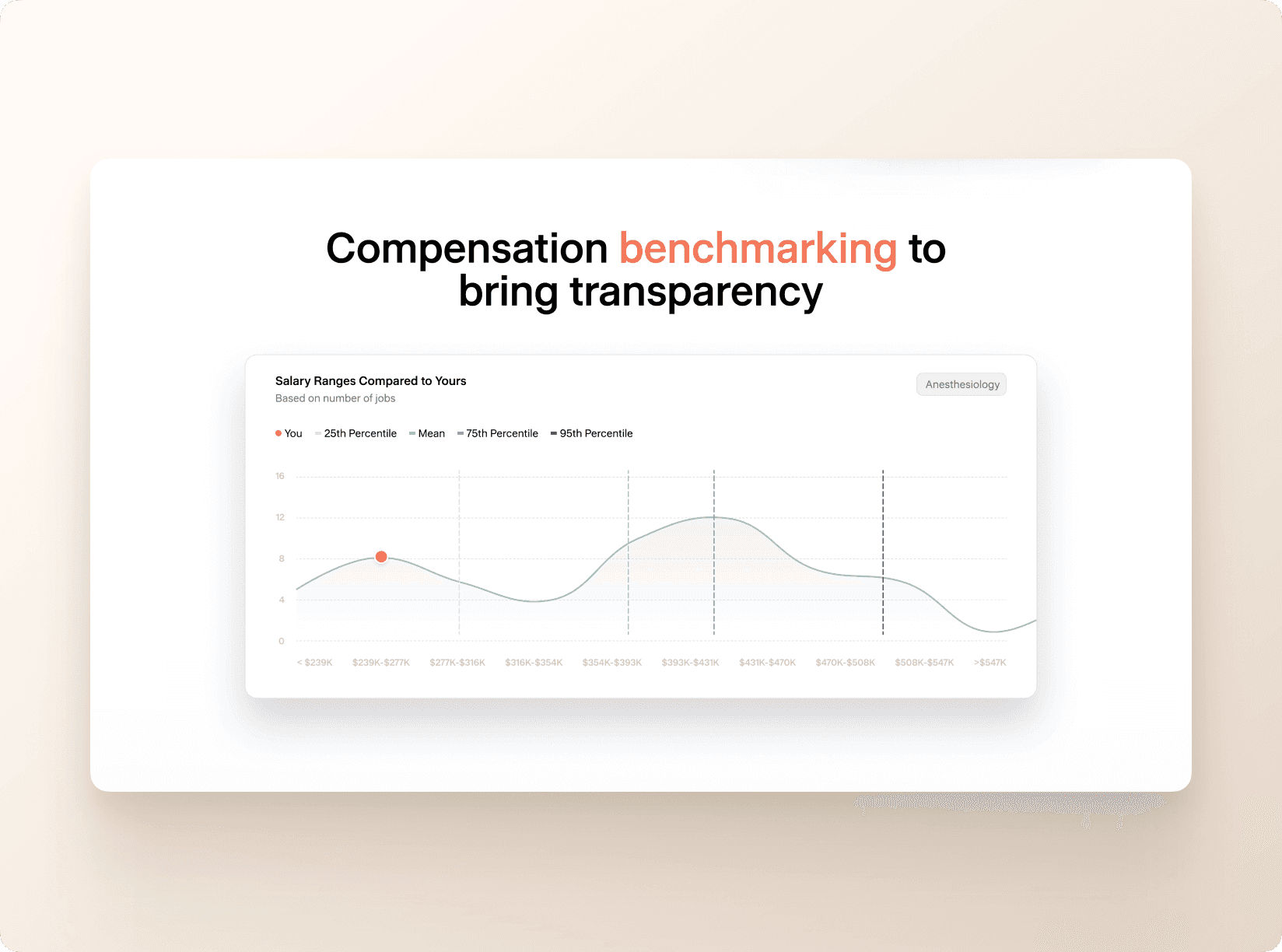
A lot of compensation sites feel cold and transactional. Our job was to create something that spoke to both sides of the experience. Yes, Offcall helps with salary transparency, but it also gives doctors community, content, and career support. The homepage had to convert new visitors while also making Offcall feel like a trustworthy place to land, not just another tool.
To bring the brand into the experience, we tied visual elements directly to the interface. The hero section uses a custom shape pulled from the Offcall logo by combining the O with the stethoscope curve. It gives people instant recognition and sets the visual tone for the rest of the site. Primary colors set the base, and secondary colors pop in where we need to separate different types of content and keep things feeling lively.
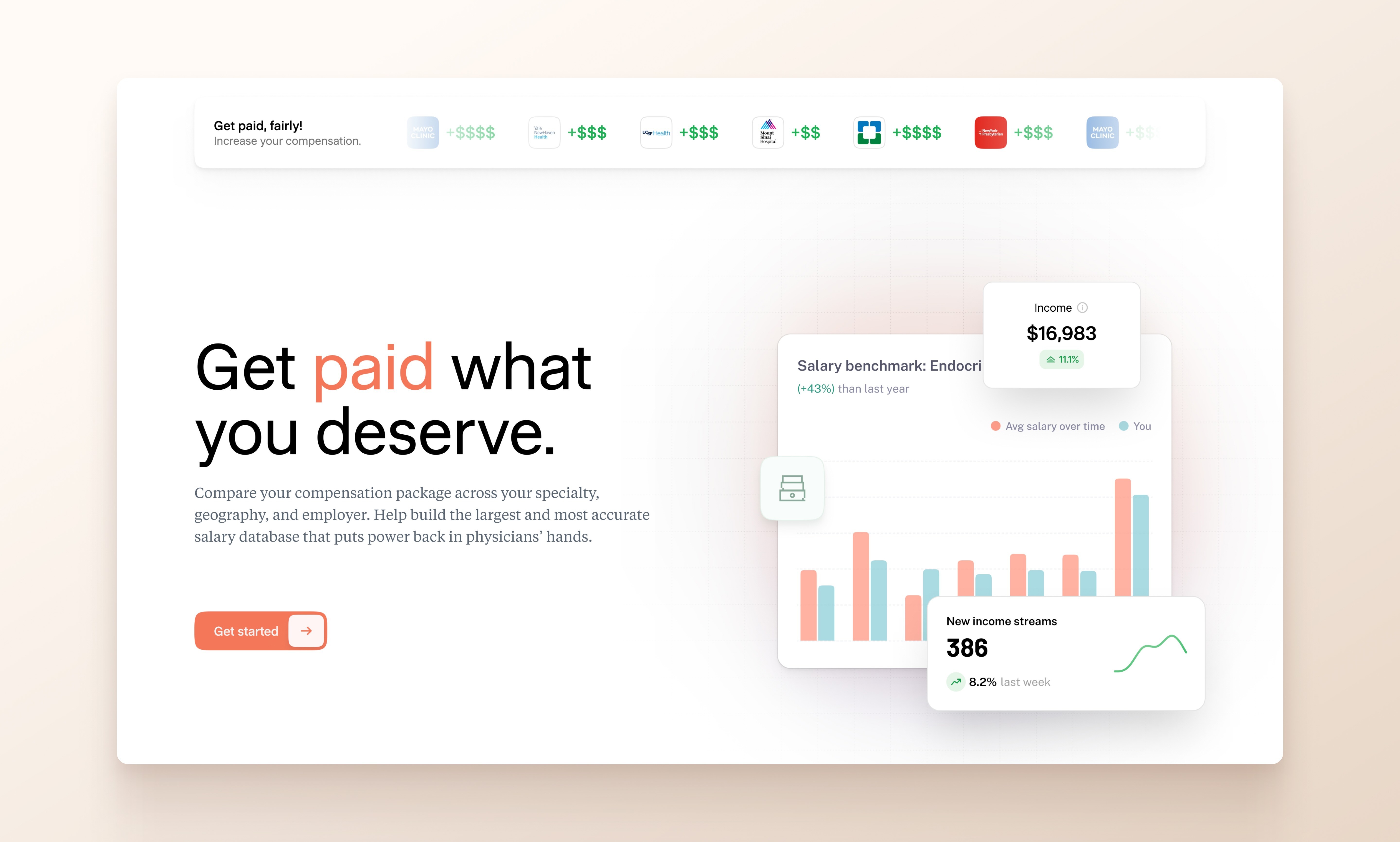
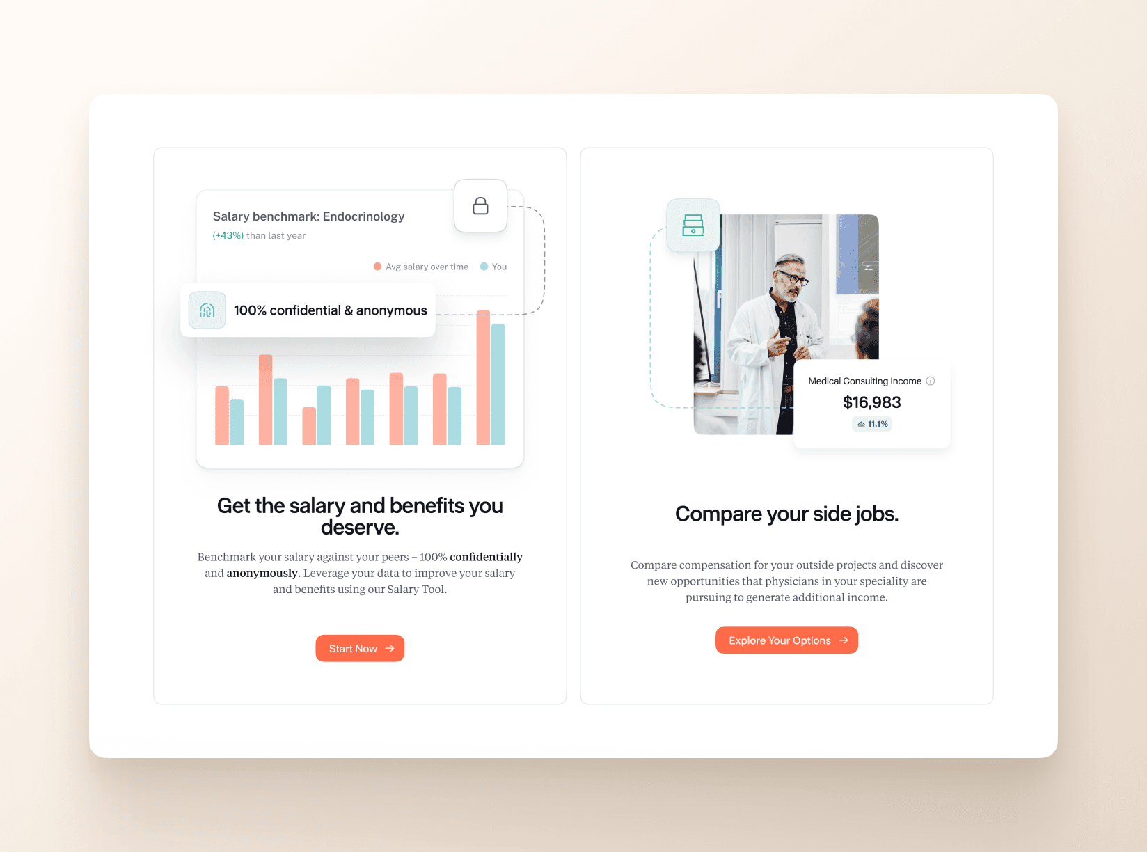
Early feedback gave us a big clue. People were reading the homepage as “only a salary tool,” even though Offcall offers a ton of content and community value. We adjusted the structure so the two sat side by side. Salary features, content library, physician stories, and career resources all share space. The final layout makes the full value of the platform clear without crowding the page.
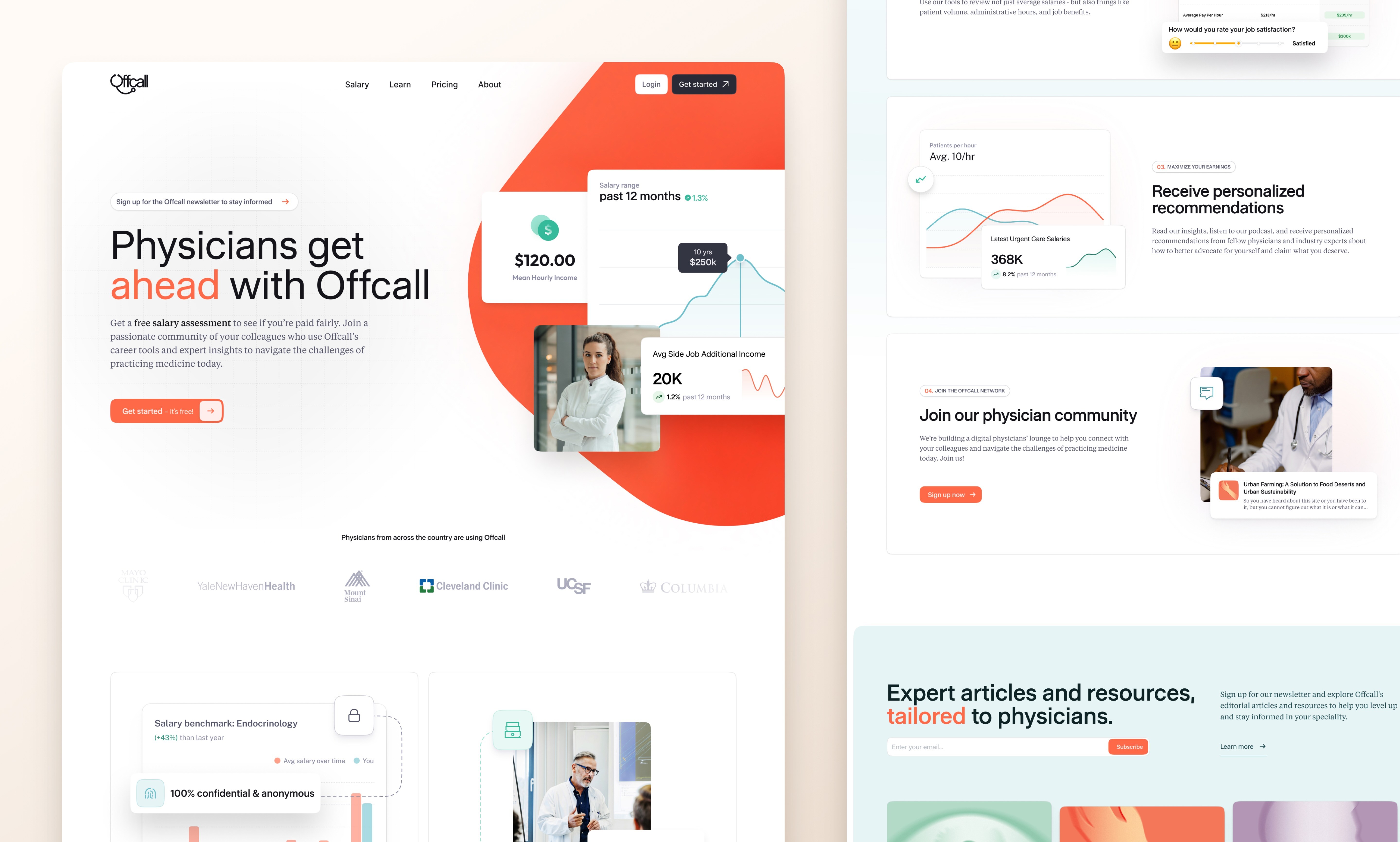
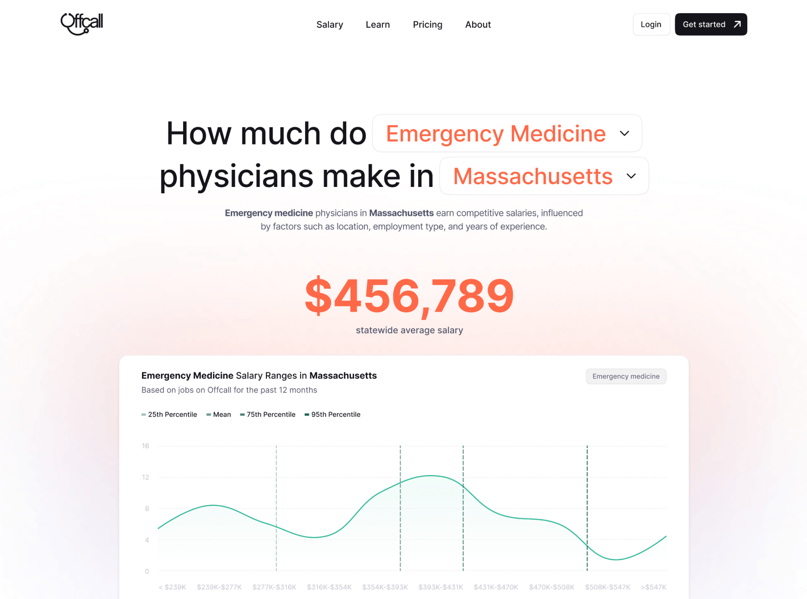
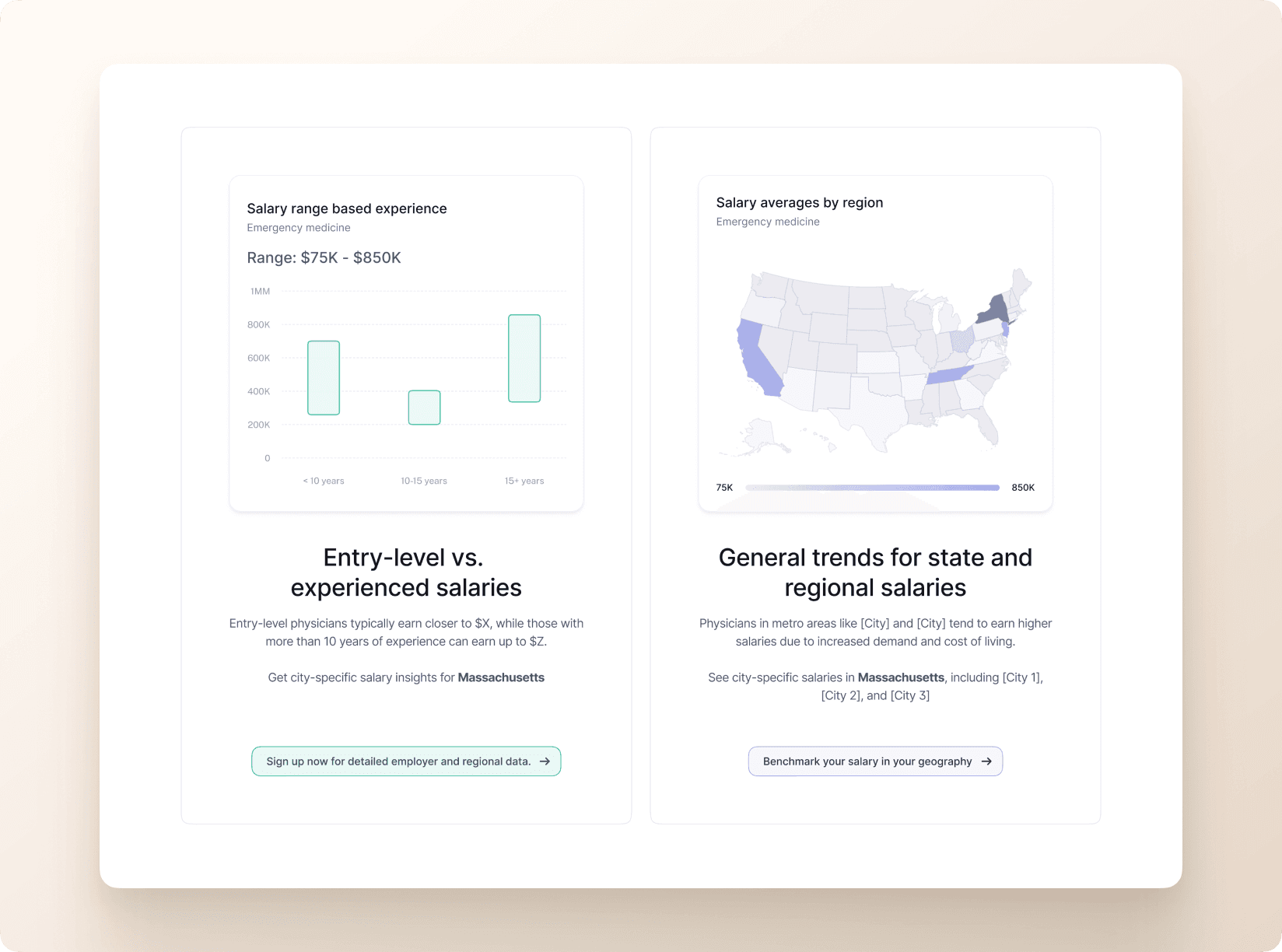
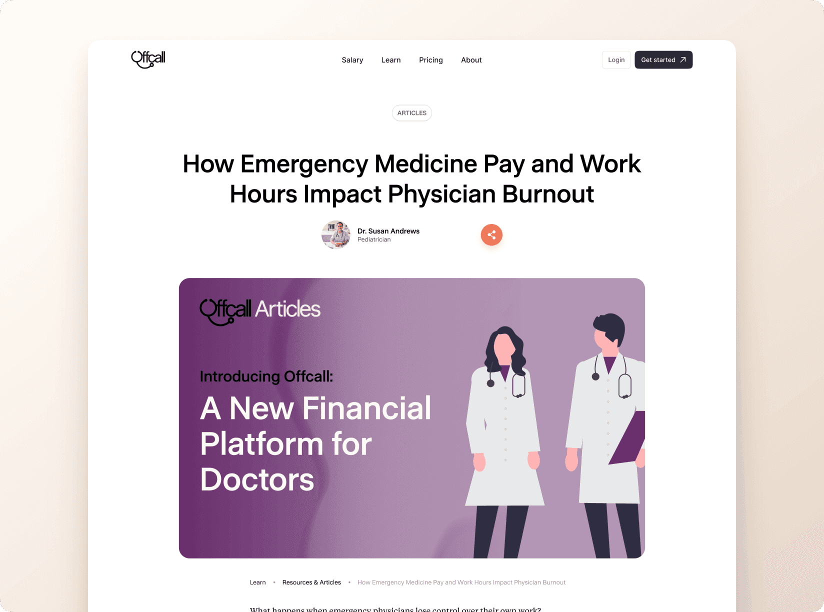
The full site structure was built to support long-term content growth. Specialty landing pages, SEO-friendly salary guides, and the “How many hours do physicians work” content series created new entry points from search. This setup now brings in more than 443,000 monthly impressions and close to 900 clicks to salary pages alone. It shows that content and product help each other when they’re built together.
Building the site took tight teamwork between design and the founding group. We worked through real-time Figma comments, quick turnaround loops, and a few weekend sprints to move fast. Stakeholder feedback shaped important calls, like adding more color to make things friendlier, highlighting content more strongly, and dialing in a warm, welcoming voice. The process brought the business goals and the design vision together in a way that felt natural.
Since launch, the site has become Offcall’s main engine for growth. Search traffic jumped from 4,380 to 5,640 clicks a month, all through organic search. The content strategy now supports nearly a thousand newsletter subscribers and more than 5,300 physician profiles, again with zero paid marketing. When the design helps people discover content easily and move into the product without friction, growth basically takes care of itself.

The website established visual and structural foundations that scale across the platform. Component systems, color strategy, and information architecture patterns extend from marketing pages into product experience. This consistency reduces friction as users move from discovery to signup to dashboard, creating a cohesive journey that builds trust at every touchpoint.
